What have I learned in DCMD so far........
I probably learned the most things in Brand Design Studio. Marketing, advertising, brand designing... generally sucking up to people in order for them to buy our products/services. We're all liars! Deceivers! We study the art of war. The war against ugliness in all forms, that is. We study the art of the devil. To lead people into temptation. That makes us designers sound bad, doesn't it? I guess that's what we do for a living. In a story, you always need the evil tempter/temptress to make the story continue. Otherwise, how is life going to go on?
"Stop your blessing bishop Gvendur, even the evil need a place to live," says the troll of the island of Drangey, northern Iceland, when bishop Guðmundur went to bless the island with holy water to rid it of evil forces. The evil cannot say the word "Guð" or "God", hence the troll said "Gvendur". [Icelandic legend]
(yes, I read these kinds of things)
In DCOM, I learned about ways of communication, past and present. The art of communication is more complex than I thought, with different roles, different systems. It is like energy. We humans cannot create or destroy energy, but we can convert it to different forms. Like say, one receives information from a visual source, then translates into words and passes the information to another person verbally. The person may or may not grasp the information 100% clearly due to several factors such as noise or limit of vocabulary. The person then either gives feedback of the information to the first person (verbally, visually, etc.) or relays it to another person (verbally, visually, etc.). Like energy, information may get lost or altered due to interferences.
We learned about visual communication. How styles of visual communication give certain expressions or feelings. Victorian style expresses historicism and honors the rich culture of the past, Plakatstil expresses simplicity and directness, etc.
In Creative Communications, I learned about word-play and drama. I believe I have covered this one back in this entry so I shall not touch on it further :)
In 3D Modelling and Visualisation, I learned how to visualise an object in all angles and model it, texture it, render it, colour it to accuracy. It helps me appreciate designs of objects more, thinking about the details the designer/inventor puts into their design/invention.
In Web Design, I learned how to create and style webpages. As the internet is the #1 platform for people to interact and source for information in this modern world, a website needs to be informative, interactive, organized and visually appealing in order to make people stay and browse. It is a great platform for advertising.
Thursday, July 8, 2010
Art Movements & Visual Experiments
Art Noveau
Style:
Examples:


Plakatstil
More examples:


My Visual Experimentation:
 I did a simple illustration of my character Nucifera, following the Art Noveau style. I only used curved lines, spirals, and different thicknesses of the lines to create a very flowy feel to the illustration. Flower elements are also added. The typography also follows the same flowy style. Overall the illustration looks decorative.

Once again I drew my character Nucifera, but in Plakatstil. It is less detailed, more simple. It looks more like a logo than an illustration. The curved lines are also not as emphasized as the one in Art Noveau style. The typography is more solid and blockish.
- A rebellion against the whole Victorian sensibility.
- Wanted to revolutionalise every aspect of design.
- Direct descendants of the Arts & Crafts Movement.
- Odd blend of art, artifice and practicality.
- 1st commercial art that is utilized for practical reasons.
- Organic, plant-like lines, freed from roots of gravity, waves, "whiplash" style
- Domination of spatial areas and other visual properties such as colour & texture
- Detailed and intricate
- Commonly used: Flowers, Vines, Birds, Human females
Examples:


---------------------------------------
Plakatstil
The Poster Style, or "Plakatstil", was begun in 1905 by Lucian Bernhard in Berlin.
For a poster competition sponsored by Priester matches, he did this =>

The stark simplicity of the design won him the competition, and marked a departure from the fussy and decorative Art Nouveau style, which was beginning to lose its vitality.
- Easy to understand
- Cheaper and faster to produce
More examples:


-----------------------------------------
What I understand about art movements is that they are formed because a certain someone or a group of people with the same ideals decided to go against a culture.
Art Noveau aimed for an art style for the new age, descending from the Arts & Crafts movement which aimed for art that wasn't all about commercialisation, which in turn was formed because it wanted to go against the former Victorian style, which was intricately detailed, took long periods of time to produce, and also costly and highly commercialised.
However, Art Noveau itself, although claiming to be of "new age", had elements of Victorian in its style. Both are just as detailed, albeit Victorian used mostly historic elements, whereas Art Noveau used mostly nature. Fantasy was also prominent in both styles:


Art Noveau & Victorian style fantasy illustrations, respectively.
The Arts & Crafts movement was sort of like a stepping stone towards Art Noveau. Due to industrialisation, machines were used in production processes, replacing the artists. Artists were basically looked down upon and their works deemed a waste of time. With technology, there was a mix of styles and a decline in creativity by engineers who lost aesthetic concern.
Social reformers William Morris and John Ruskin tried to salvage the situation, along with other artists, architects and writers. Ruskin focused on his philosophy that art and labour should be united to serve society, such as in the construction of a medieval Gothic cathedral where the intricate designs of the building are prominent. Morris believed that art & craft should be combined to create beautiful things of all ranges and make art a part of everyday life. He dedicated himself to fight ugliness in all forms.
Thus, with the Arts & Crafts movement, the respect for art is once again restored, allowing the Art Noveau to step in, trying to reform all aspects of design in "preparation for the new age".
Examples of Arts & Crafts style:


Then comes Plakatstil. Its stark simple designs gave the people a break from the intricately detailed, patterned and colourful styles of the Art Noveau. Because of this ultra-big contrast, Plakatstil was revolutionary, and quickly overshadowed the Art Noveau.
At that time, there was this "Modernist" idea in Europe where people prefer designs that are simple and straight to the point. A contrast to the old style of historicism and finely detailed, colourful designs. This was probably why Plakatstil was accepted so quickly. It is also cheaper and faster to produce due to its simplicity. As people become more and more money-minded and business-oriented, Plakatstil was the way to go in order to save money yet bring messages across easily.
Plakatstil's influence continues until today. (In my opinion, it's still because people are money-minded and business-oriented. Because simplicity = easy to recognize and remember = familiarity = trust/reliability = consumers buy product/service = $$$)
Examples of modern Plakatstil:


-----------------------------------------
My Visual Experimentation:
 I did a simple illustration of my character Nucifera, following the Art Noveau style. I only used curved lines, spirals, and different thicknesses of the lines to create a very flowy feel to the illustration. Flower elements are also added. The typography also follows the same flowy style. Overall the illustration looks decorative.

Once again I drew my character Nucifera, but in Plakatstil. It is less detailed, more simple. It looks more like a logo than an illustration. The curved lines are also not as emphasized as the one in Art Noveau style. The typography is more solid and blockish.
Brand Archetypes & Metaphors
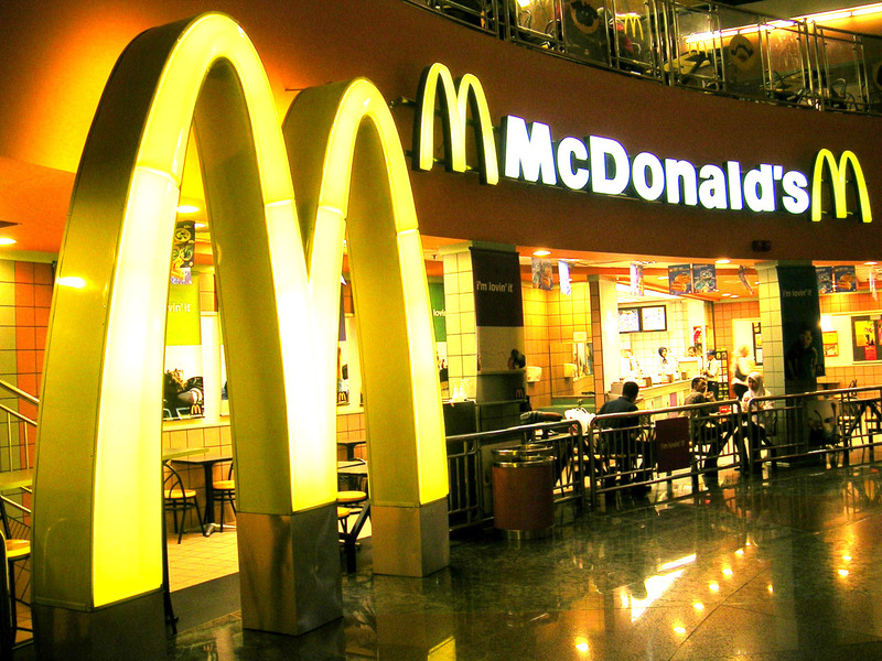
#1 The Loyalist

 McDonald's.
Everyone knows what it is. Everyone has eaten there at least once in their lives. We see it everywhere. We know how the food is like, how the service is like. Many people are loyal to it and eat there every so often because they are used to the food and service there. They are all certain of the brand.
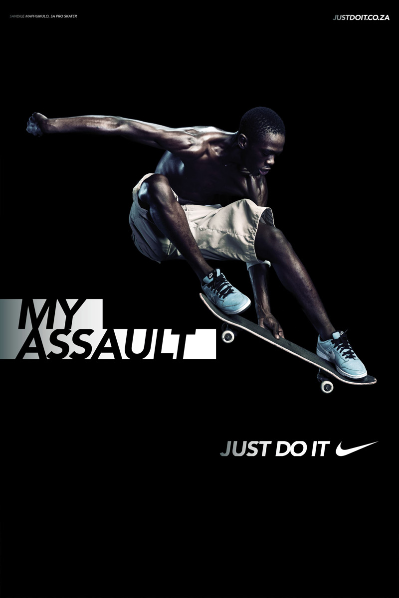
#2 The Hero
 Nike.
Nike.
We all know what it is. We all know that it produces quality sportswear. Very few if not none question its products or services. The brand is trustworthy and reliable in producing quality sportswear.
#3 The Wise Old Man
 Ya Kun Kaya Toast.
Old style food, old style atmosphere. This brand tries to uphold traditions, incorporating a few modern things to stay in the era, but keeps the heritage.
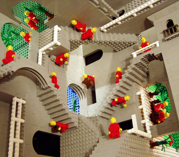
#4 The Creator
 Lego.
Lego.
The brand promotes self-expression. People are forced to come up with designs and execute them using the product.
#5 Mother of Goodness
 Dettol.
A caring, nurturing brand. Products are mainly for one's health, cleanliness and well-being.
#6 The Little Trickster
 Fanta.
The brand is known to be fun-loving, cheerful, colourful, and helps people to have a good time with its products.
#7 The Enigma

Anything & Whatever.
The brand packages its drink products in a way that all the packaging is generic. There is no way of telling what drink you get (unless some observant ones guess from the ingredient list). It gives a feeling of uncertainty. You don't know if the flavor you get will be something you like or not until you drink it. Because of this enigma element, people who purchase this product are either just adventurous or can't make up their minds.
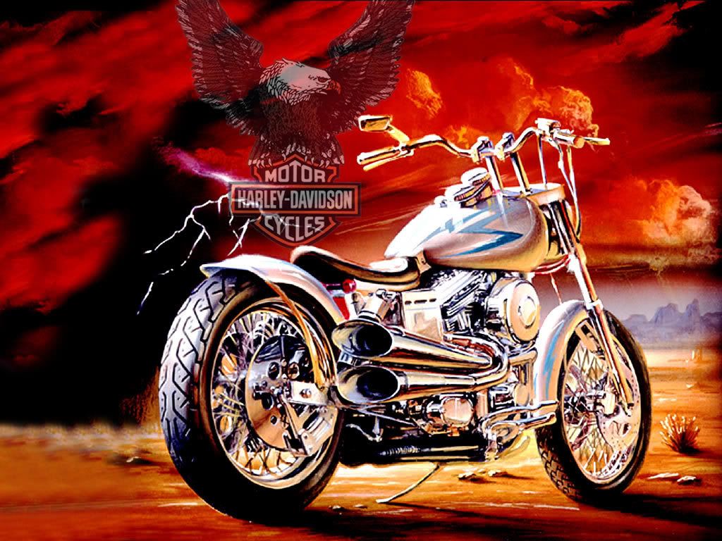
#8 The Anti-Hero
 Harley-Davidson.
The brand spells "danger", "wild", "unrepentance" using elements such as engines and fire. It provokes you to bring out your inner rebel.
#9 The Change Master
 Volkswagen.
Helps people feel free, pioneering, express their individuality. For people who wish to differentiate themselves from a comformist brand.
#10 The Ultimate Strength
 IKEA.
IKEA.
Its products are of everyday functionality and produced with a down-home organizational culture. However, it isn't just any ordinary furniture shop for most people. It has proven its worth, earned many people's trust in producing quality furniture with excellent service.
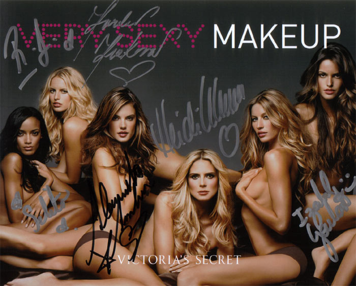
#11 The Siren
 Victoria's Secret.
One word: Seduction.
The brand provokes your guilty pleasures.
#12 The Powerbroker
 Microsoft.
We all know what it is. The brand probably has the world in the palm of its hand. The world wouldn't be able to survive without it. It is a powerful brand of domination and control. (There's also Apple.Inc, but they're not as widely used as Microsoft.)
 McDonald's.
Everyone knows what it is. Everyone has eaten there at least once in their lives. We see it everywhere. We know how the food is like, how the service is like. Many people are loyal to it and eat there every so often because they are used to the food and service there. They are all certain of the brand.
#2 The Hero
 Nike.
Nike.We all know what it is. We all know that it produces quality sportswear. Very few if not none question its products or services. The brand is trustworthy and reliable in producing quality sportswear.
#3 The Wise Old Man
 Ya Kun Kaya Toast.
Old style food, old style atmosphere. This brand tries to uphold traditions, incorporating a few modern things to stay in the era, but keeps the heritage.
#4 The Creator
 Lego.
Lego.The brand promotes self-expression. People are forced to come up with designs and execute them using the product.
#5 Mother of Goodness
 Dettol.
A caring, nurturing brand. Products are mainly for one's health, cleanliness and well-being.
#6 The Little Trickster
 Fanta.
The brand is known to be fun-loving, cheerful, colourful, and helps people to have a good time with its products.
#7 The Enigma

Anything & Whatever.
The brand packages its drink products in a way that all the packaging is generic. There is no way of telling what drink you get (unless some observant ones guess from the ingredient list). It gives a feeling of uncertainty. You don't know if the flavor you get will be something you like or not until you drink it. Because of this enigma element, people who purchase this product are either just adventurous or can't make up their minds.
#8 The Anti-Hero
 Harley-Davidson.
The brand spells "danger", "wild", "unrepentance" using elements such as engines and fire. It provokes you to bring out your inner rebel.
#9 The Change Master
 Volkswagen.
Helps people feel free, pioneering, express their individuality. For people who wish to differentiate themselves from a comformist brand.
#10 The Ultimate Strength
 IKEA.
IKEA.Its products are of everyday functionality and produced with a down-home organizational culture. However, it isn't just any ordinary furniture shop for most people. It has proven its worth, earned many people's trust in producing quality furniture with excellent service.
#11 The Siren
 Victoria's Secret.
One word: Seduction.
The brand provokes your guilty pleasures.
#12 The Powerbroker
 Microsoft.
We all know what it is. The brand probably has the world in the palm of its hand. The world wouldn't be able to survive without it. It is a powerful brand of domination and control. (There's also Apple.Inc, but they're not as widely used as Microsoft.)
-------------------------------------------
Here on, I'll be picking 3 of the brands above and analyzing them further with the help of Zaltman's Marketing Metaphoria.
#1 Ya Kun Kaya Toast

#2 Anything & Whatever

#3 Microsoft

Here on, I'll be picking 3 of the brands above and analyzing them further with the help of Zaltman's Marketing Metaphoria.
- Balance
- Transformation
- Journey
- Container
- Connection
- Resource
- Control
#1 Ya Kun Kaya Toast

- Balance
- Container
- Resource
#2 Anything & Whatever

- Balance
- Journey
#3 Microsoft

- Balance
- Transformation
- Connection
- Control
Wednesday, July 7, 2010
Personal Brand DNA

This is my personal brand. I call it the Catshroom.
The cat is to represent my pampered, lazy, feisty side.
The mushroom is to represent my rigid, nocturnal side with my short-lived attention span.
It has a mysterious and mischievous expression. I like to trick and scare people.
The spirals just add to the sleek, twisted appearance. I'm a fan of spirals.
I like the colour mint green, in which I coloured the spots. The pink just happened to match it. Overall, the bright colours give it a more vibrant, cheerful yet poisonous look.
"I am approachable even though I look scary. I can be really nice, but don't take me for granted :)"
--------------------------------------------------

This is the logo I designed for the CAAS project.
Let me copy-paste the rationale from my brand proposal...
Rationale
 The logo showcases the past, present, and future of Singapore’s aviation using the silhouette of planes. The topmost plane is the ‘past’ plane, modelled after the 1940s airplanes. The bottommost plane is the ‘present’ plane, and the middle plane is the ‘future’ plane, with its shape inspired by the Stealth plane, one of man’s latest inventions, which I slightly altered to look like an arrow head to show how Singapore aviation is moving forward. The colours used from the past, present and future planes are earthy colours to represent the country soil, Singapore being “A little red dot”, and potential. The colours get brighter to show that the Singapore aviation has a bright future ahead. The lines trailing behind the planes help to shape the island of Singapore. The overall shape of the lines and the planes were inspired by the USB symbol, to represent connectivity. Following the feedback given, I have increased the sizes of the planes so that the shapes can still be made out when the logo is minimized. The text “100 Aviation Years Singapore” is to show viewers that we are celebrating 100 years of aviation in Singapore, along with “Since 1911” to show when Singapore’s aviation history started. The tagline “Connecting. Shaping. Advancing.” is to help viewers break down the elements of the logo to see: the tweaked USB symbol - which also shows how the Singapore aviation helps to connect people around the world, the outline of the shape of the island of Singapore - which also shows that the Singapore aviation is the country’s foundation and pride and the celebration is nation-wide, and also the evolution of the plane models - which shows the advancement of Singapore’s aviation industry. Following the feedback, I added the words “Since 1911” into the logo. I used a sans serif font for the “100 Aviation Years Singapore Since 1911” and the tagline which is rigid and therefore shows stability. Following the feedback to make the tagline font more matching with the font used in the woodmark, the font for the tagline is also sans serif instead of the previous script, angled to the direction of the planes to emphasize on the aviation ‘moving forward’. The specific fonts I chose also match the symbolmark in a way that there are many horizontal lines and barely any curves. Overall, the logo looks futuristic.
--------------------------------------------------
Comparing a personal brand and a corporate brand like above, a personal brand is more flexible because a personal brand is, well, personal. You can use any colour you want, anything you want, because its only purpose is to represent the human you are. Anyone can judge your brand, but it doesn't matter.A corporate brand on the other hand, must have qualities that attract most people and tell about how good the company is. Every element of the brand should make the company look good, as I've bolded in the rationale above. This is because the company wants to be respected and wants people to support it, to purchase products or services from it, to be a walking advertisement for it so more people would be supporting it, they need to make money. In short, anyone can judge the brand, but this time it matters.
A few similarities though, is that every element of a brand identity has a reason for being a part of it, even in a personal brand where anything and everything can happen. I designed my brand that way because I think that's what fits me.
Brands should always look visually appealing. It's of number one importance to me because if your brand is able to grab people's attention in one glance, then people will actually bother to find out what your brand is all about. I tend to use contrasting colours so my designs stand out more. I also tend to use simple shapes that are easy to recognize. I like vector style art.
Communication

It's the general communications model that I created :)
Interpreter: Receives messages from one or many sources, understands them.
Encoder: Re-expresses information/messages and sends it out.
Message: The actual information; content, sent from a sender to a receiver.
Channel: The medium or method used to transmit a message.
Noise: Anything that interferes with the transmission of a message.
Decoder: Receiver of message.
Feedback: Reaction or response of receiver on a sender's message, sent back to the sender/encoder. Receiver/decoder may also give response to the sources directly.
---
To me, effective communication is when your intended message is correctly and accurately received and understood by your audience.
There are many ways to communicate, and no matter what form of communication it is, it requires at least one of our senses.
Our Creative Communications module teaches us to communicate creatively. Poems, stories, drama, etc. to convey an idea. It makes use of mostly sights and sounds. It makes us pick out important characteristics of a certain idea and find ways to express them.
For example, when we were asked to demonstrate a forest, we had to pick out characteristics of a forest such as trees, wild animals, hunters. Then we had to understand the characteristics of the trees, wild animals and hunters. Trees have many long branches and twigs, they sway in the wind. So, we as humans stretch out our arms and fingers like branches and sway, keeping our feet still on the ground like roots.
In our Branding Design Studio module, we deal with sights, sounds, tastes, touches, smells... anything that can help convey our ideas to the audience.
When we want to advertise something, we make visually eye-catching items like posters (sights), we let people sample our new food or drink products (tastes), we let them listen to previews of new albums (sounds), we let them feel textures of products (touches), we let them take a whiff of new perfumes or food items (smells)... for what reason? To let people experience something so good yet so little, that they would want more. It urges people to spend their money to get it.
We are all liars, deceivers, in that sense. We take something which may not be appealing, but with the art of expression, we touch into the psychology of people and brainwash them to take action.
This explains how important communication is. Without communication, a subject is just another particle of space dust. It does not get recognized or acknowledged, no matter how good or important it is.
At this point, I would like to share a quote which I heard from somewhere, but cannot remember. I may have rephrased it too. I don't know.
"How is it that 26 mere letters of the alphabet can make us happy, sad, angry, disappointed, excited?"
Values & Needs
One’s values and needs are powerful motivations.
Values, along with beliefs, create behaviour. Values are not something you are born with -- they are gained over time, experiences, and beliefs. For example, when you were a kid, your mother always told you that you have to study hard and enter good schools, again and again. This became a value and you lived with it, whether consciously or unconsciously. When examinations are approaching, you remember that value and feel the need to study in preparation for the papers. Your emotions may disagree with you and choose to do something else instead, but you will feel guilty without fail, because your values tell you otherwise. This is how powerful values are. They keep you in control, telling you what is good, what is beneficial, what is important, what is wrong, etc. They greatly affect what actions you will take.
Needs also play a part in creating behaviour. Needs are personal, and they are usually attained naturally without having anyone to tell you or remind you. A need can be physical, such as food or water, or it can be psychological, such as self-respect or stability. If one’s needs are not met, there would definitely be a negative outcome. For example, if you are famished, you feel the need to eat, and this motivates you to get up, walk to that fridge, and grab some food. It can even be food that you do not usually eat, but since you desperately need it lest your survival is at stake, you will eat it anyway. This is how powerful needs are. Needs are able to overshadow your emotions and therefore greatly affect your actions.
But which is the more powerful, values or needs? In my opinion, it depends on the individual. For example, if you are famished, but the only food available is across a burning pit in which you have to jump to reach it, will you risk your life and jump over, or will you refrain from jumping and think of other ways to get food? An Olympic high-jumper, for instance, will probably choose to jump over the pit because he knows he could do it even though he knows it is dangerous and still holds a risk. That, or he is just an ordinary salaryman with a great confidence. In this case, his needs overshadow his values. On the other hand, the average salaryman may not want to jump over because he knows he is incapable of such a feat, and that he will fall into the pit and die if he tries. That, or he is just an Olympic high-jumper with no confidence. In this case, his values overshadow his needs. How these people allow their values/needs to overshadow their needs/values depend on their beliefs; the way they have been brought up. Therefore, different people have different values and needs.
How do one’s values and needs affect one’s communication? Communication, in my belief, is the way one expresses his or her thoughts, and in short, a behaviour. Earlier, I have addressed how values and needs affect one’s behaviour. For example, you would most likely refrain from telling your best friend that you dislike something about him/her because you do not want him/her to feel hurt or to jeopardise your friendship. In this case, you are favouring your values. However, if that something you dislike of your best friend begins to cause serious problems, you feel the need to tell your friend about it with a good intention, although you may risk jeopardising the friendship. In this case, you are favouring your needs.
Values and needs are motivators that affect how, why, when, where, what, and who to communicate.
Reintroduction
- · What did I do well last year?
Distinctions for Interactive Authoring and Experience Design Methods.
As for The World Today and Critical Reasoning Skills.
- · What did I do badly last year?
B for Visual Design Studio.
- · Did I achieve my goals last year? How much of it did I achieve?
A bit. Barely half of what I wanted.
- · What stopped me from achieving those goals?
Lack of time (Or rather, poor time management. Cause everyone’s given 24 hours a day.)
Inspirations come on the 11th hour.
Lack of practice; unable to fully utilize programs’ functions.
Other commitments.
- · What are my goals this year?
To get Distinctions and As for all my modules!
- · What do I promise to do if I encounter difficulties and am unclear about anything related to the class?
ASK lecturer and/or friends. Can also go online and search for information.
- · What am I committed to achieve in this class?
Understanding the psychology of communication and culture.
- · Who I am (name), and some brief, distinctive things about myself.
Hi I’m Charissa Gabriella Chandra. I am quite obsessed with the internet and many worldly cultures, especially Japanese. My main hobbies are surfing the net, playing video games, drawing, and cosplaying. I stick to my own trends and don’t like to follow the crowd. I’m not weird. I’m unique :)
- · What is my (Unique Selling Proposition)? List a few possibilities.
Colourful
Always finish my work on time
Loves character designing, especially anthropomorphism
Flexible portrayal of many personalities (only my closest friends know this. It's a result of cosplaying.)
- · What bad habits of mine do I intend to do something about over the semester?
Procrastination is my baddest habit. Then again, everyone has that right? I guess I can try to better prioritize my needs over my wants, and not let my emotions affect my actions.
Also I’m very defensive when it comes to meeting new people. I judge people from the outside easily, which makes it difficult to make friends. Maybe I’ll scare my clients away. I need to get friendly, even if it’s only pretending. I’m sure things will go well after a while.
- · What is my promise to the class this year... (What I can contribute to make it a better learning environment for everyone, etc)
I’ll make sure to contribute my ideas and opinions during lessons, and share my energy food with them, and help out if anyone needs tutoring for photoshop/illustrator/flash though I’m not an expert myself.
- · What I would like to achieve in my three years in the DCMD course?
Cumulative GPA of at least 3.8!
Maintain my scholarship till I graduate!
Win in at least 1 competition which I participate!
…hey they rhyme.
And I hope I get a clearer idea of what I’m pursuing in my life. Will I be a designer?
Subscribe to:
Comments (Atom)